Introduction
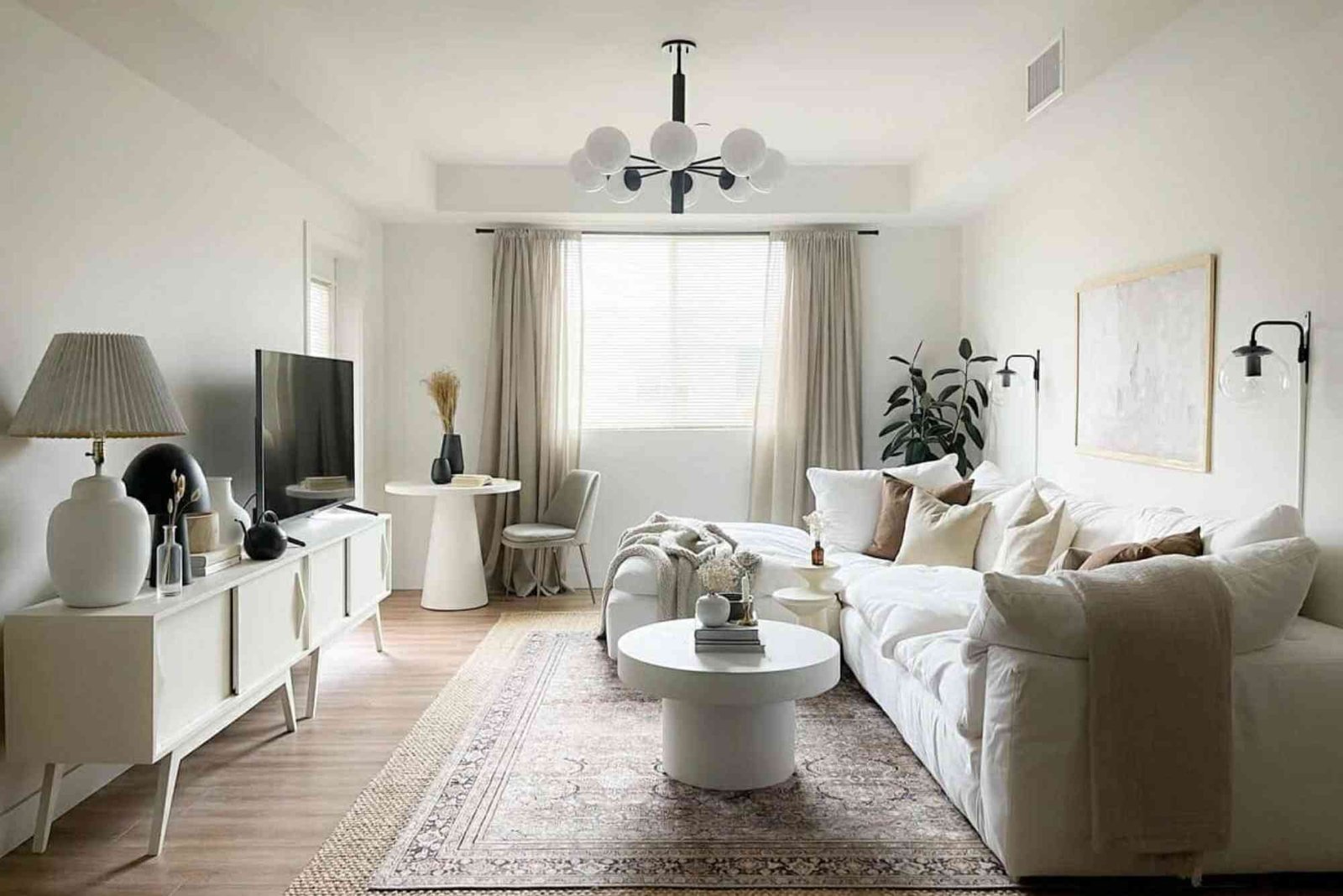
Creating a serene and inviting home starts with the colors you choose. Neutral tones are timeless, versatile, and perfect for designing calm interiors that feel both cozy and sophisticated. From soft beiges to gentle grays, these shades create a peaceful backdrop for furniture, décor, and personal touches. Choosing the right neutral color palette can transform your home into a sanctuary, reducing visual clutter and promoting relaxation.
Neutral color palettes offer a balance between warmth and coolness, making them suitable for any room, from living areas to bedrooms. By combining subtle tones, you can achieve a harmonious look without overwhelming the senses. This guide explores top neutral color palettes for calm interiors, providing inspiration and practical tips to elevate your space with understated elegance.
Understanding Neutral Colors
Neutral colors are versatile shades that do not dominate a space. They include beiges, grays, whites, taupes, and soft browns. These tones act as a canvas, allowing furniture, textures, and accent colors to stand out. Neutral shades are known for their calming effect, making them ideal for interiors that prioritize comfort and relaxation.
The appeal of neutral colors lies in their ability to complement almost any design style. Whether you prefer modern minimalism, classic traditional, or cozy farmhouse aesthetics, neutral palettes provide the flexibility to experiment with textures, patterns, and materials without clashing.
Why Choose Neutral Palettes for Calm Interiors
Neutral color palettes are popular for creating calm interiors because they reduce visual noise. Loud, vibrant colors can energize or distract, but subtle neutrals promote peace and balance. These shades also enhance natural light, making rooms appear brighter and more spacious.
Using neutral colors strategically can help define different zones within a room. For example, a soft gray wall can anchor a living room, while beige furniture adds warmth. Layering different neutral tones creates depth, ensuring the space feels rich and inviting instead of flat or monotonous.
Neutral palettes are timeless, which means your interiors won’t feel dated quickly. Unlike bold hues that may go out of style, neutrals remain elegant and adaptable, allowing you to change accents and furnishings easily without repainting.
Popular Neutral Color Palettes for Calm Interiors
Selecting the right neutral palette involves combining complementary shades that enhance serenity. A successful palette balances warmth, coolness, and subtle contrasts to create a cohesive look. Here are some of the most popular neutral palettes:
Soft Beige and Cream
Beige and cream create a warm, soothing atmosphere perfect for living rooms and bedrooms. Cream walls reflect light beautifully, while beige accents in furniture or textiles add a subtle richness. This combination is versatile, pairing well with natural wood, muted golds, or soft pastel accents. The result is a welcoming and tranquil environment that feels light and airy.
Warm Taupe and Sand
Taupe and sand offer earthy warmth, ideal for interiors seeking a grounded, natural feel. These tones work beautifully in living rooms, studies, and bedrooms. Using sand-colored walls with taupe furnishings creates an understated elegance. Complementing these shades with linen textiles or jute rugs enhances the sense of calm, making the room feel cozy yet sophisticated.
Cool Gray and Soft White
Gray paired with soft white delivers a modern, minimalist aesthetic without feeling cold. Light gray walls provide a neutral canvas, while white trim and furniture create crisp, clean lines. This palette is particularly effective in spaces with abundant natural light. Adding glass, metal, or stone elements maintains visual interest, ensuring the interior feels serene but not stark.
Greige for Versatility
Greige, a mix of gray and beige, is a versatile neutral that bridges warm and cool tones. It adapts to multiple lighting conditions and pairs with virtually any accent color. Greige walls and furnishings provide subtle contrast and sophistication. This palette is perfect for open-plan spaces, as it unifies different areas while maintaining a calm, cohesive look.
Muted Browns and Ivory
Combining muted browns with ivory creates a timeless, layered feel. Darker brown furniture contrasts with ivory walls or textiles, offering depth without overwhelming the senses. This palette works well in traditional, rustic, or transitional interiors. Incorporating natural materials like wood and leather enhances the cozy, grounded vibe.
Soft Pastels with Neutrals
Soft pastel shades, when paired with neutral tones, can add gentle color while preserving calmness. For instance, pale blush, mint, or powder blue accents against beige or gray walls create subtle visual interest. This approach is ideal for bedrooms, nurseries, or any space where you want a hint of personality without sacrificing tranquility.
Tips for Using Neutral Palettes Effectively
Achieving calm interiors with neutral colors requires more than just picking shades. Consider these tips to make the most of your palette:
Layer Textures
Layering textures adds depth and dimension to neutral interiors. Incorporate soft fabrics, woven rugs, natural wood, or matte finishes to prevent the space from feeling flat. Textures make neutral tones visually interesting and create a tactile, inviting atmosphere.
Use Accent Colors Sparingly
Even in neutral interiors, subtle accents can enhance the space. Consider muted greens, blues, or metallics to highlight features like cushions, artwork, or decorative items. Keep accents minimal to maintain the serene feel.
Balance Warm and Cool Tones
Neutral palettes work best when warm and cool tones are balanced. For instance, if your walls are a cool gray, add warm beige or wood accents to soften the space. This prevents the room from feeling too sterile or cold.
Pay Attention to Lighting
Natural and artificial lighting affects how neutral colors appear. Test paint samples at different times of the day to ensure the shades maintain their calming effect. Use layered lighting, including ambient, task, and accent, to enhance the mood.
Emphasize Clean Lines
Neutral colors highlight architectural features and furniture shapes. Clean, simple lines complement the subtlety of neutral palettes, reinforcing a calm, uncluttered aesthetic.
Benefits of Calm Interiors
Designing your home with neutral palettes offers numerous advantages. A calm interior improves mental well-being by reducing stress and visual overstimulation. It creates a versatile backdrop for different décor styles, allowing easy updates over time. Neutral interiors also appeal to guests and potential buyers, as the soothing atmosphere feels universally inviting.
Calm spaces encourage relaxation, focus, and quality family time. In bedrooms, these palettes foster restful sleep. In living areas, they create comfortable zones for conversation and connection. Overall, using neutral tones strategically can elevate both the beauty and functionality of your home.
Common Mistakes to Avoid
While neutral palettes are forgiving, there are pitfalls to watch out for. Avoid using only one flat tone, which can make a room feel dull. Instead, layer complementary shades for depth. Be cautious with lighting, as certain neutrals may appear washed out in low light. Finally, don’t neglect textures and materials—they are crucial for adding warmth and interest to a neutral space.
Neutral color palettes are an essential tool for creating calm interiors that feel timeless, elegant, and welcoming. Whether you prefer warm taupes, soft grays, creamy whites, or versatile greiges, these shades provide a serene foundation for your home. By layering textures, balancing warm and cool tones, and incorporating subtle accents, you can craft spaces that are both aesthetically pleasing and emotionally soothing.
For homeowners seeking tranquility and timeless appeal, investing in neutral palettes is a simple yet transformative choice. Start experimenting with these tones today and discover the calming power of carefully curated interiors.
Transform your living space with these top neutral color palettes for calm interiors and enjoy a home that reflects peace, style, and sophistication. Explore more tips, trends, and inspiration to design your dream interior.
Discover how to elevate your living space with the latest innovations in home illumination. From energy‑efficient smart bulbs to statement‑making fixtures that blend form and function, staying updated on lighting trends can transform any room. Learn about the Top Lighting Trends Every Home Needs in 2025 to brighten your décor and enhance comfort — check the full guide here:
FAQ
What are the most calming neutral colors for interiors?
Soft beiges, warm taupes, cool grays, creamy whites, and greiges are considered the most calming neutral colors.
How do I make neutral interiors look interesting?
Layer textures, mix warm and cool tones, and use subtle accent colors for depth and visual appeal.
Can neutral colors make a small room feel bigger?
Yes, light neutrals like soft whites and pale grays reflect light, creating a sense of spaciousness.
Are neutral color palettes suitable for all interior styles?
Absolutely. Neutral tones complement modern, traditional, minimalist, and rustic designs effectively.
How can I add color without disturbing the calm vibe?
Introduce muted pastels or metallic accents sparingly through décor, cushions, or art pieces.